Hey! you can find lots of information on my linkedin profile. Just click on the link below.
link.co/2a5d
Hire Me
Let us talk about your ideas, feel free to filling your questions.
marginpatel19@gmail.com
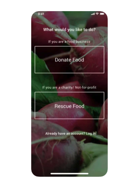
Food2Spare is a food donation management solution for businesses looking to reduce their food waste.
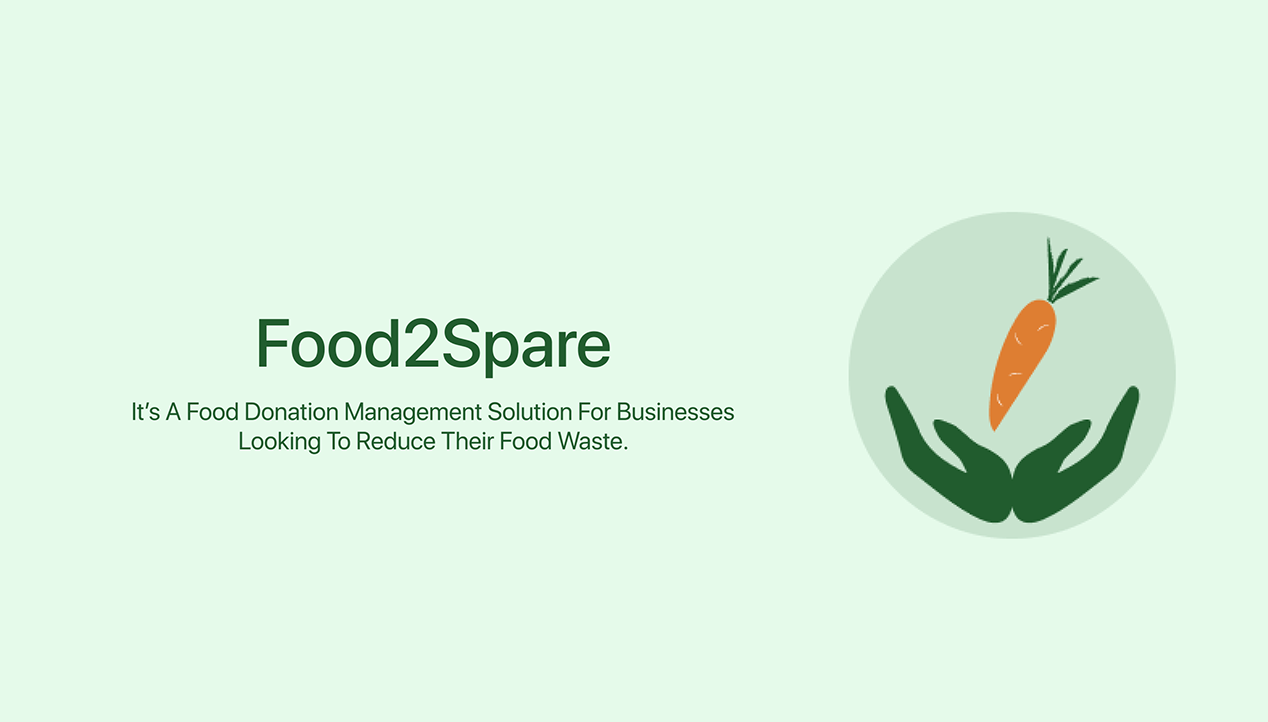
Food2Spare is a food donation management solution for businesses looking to reduce their food waste. Connecting food businesses with food donation partners so that they can reduce their food waste and positively impact their community and the environment.
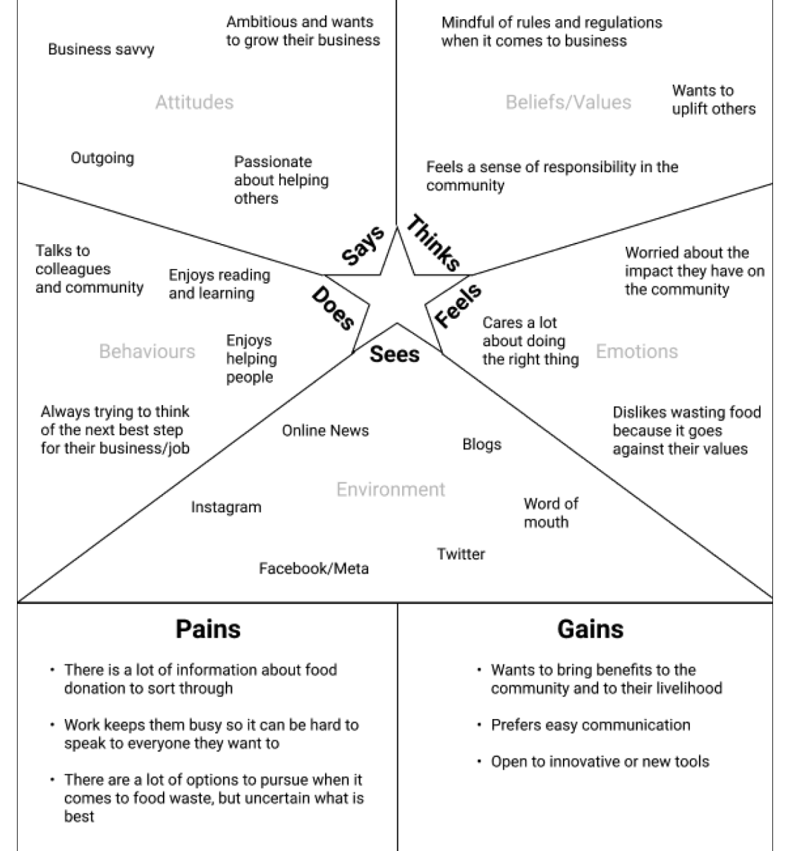
A grocery store owner needs an easy and efficient way to connect with a food donation partner because they want to reduce their grocery's food waste while positively impacting their community and the environment.
This was a group project, we completed all of the work in a group, from research to building. We had three members in our group. My responsibilities as a group member was to validate the app ideas.
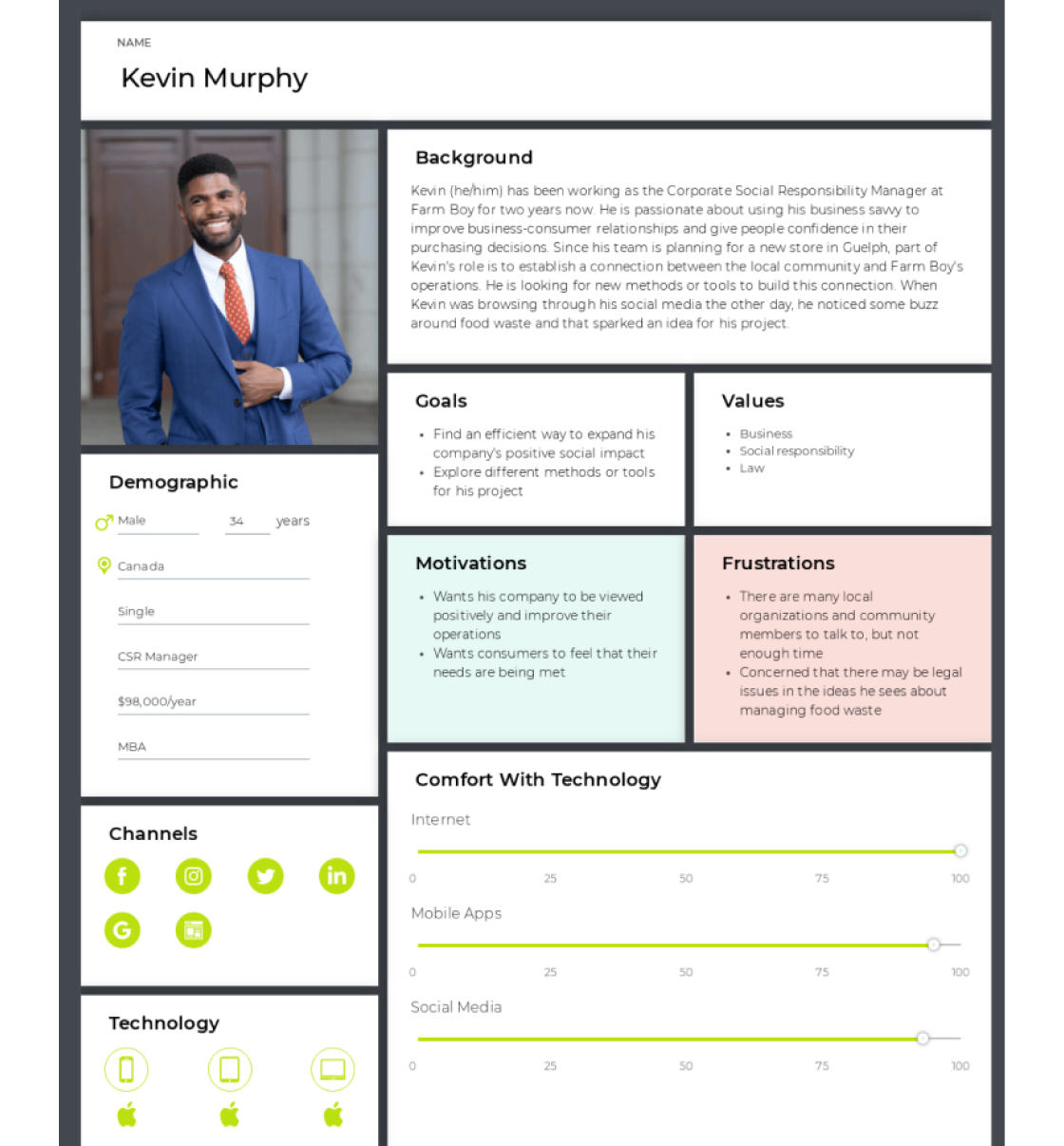
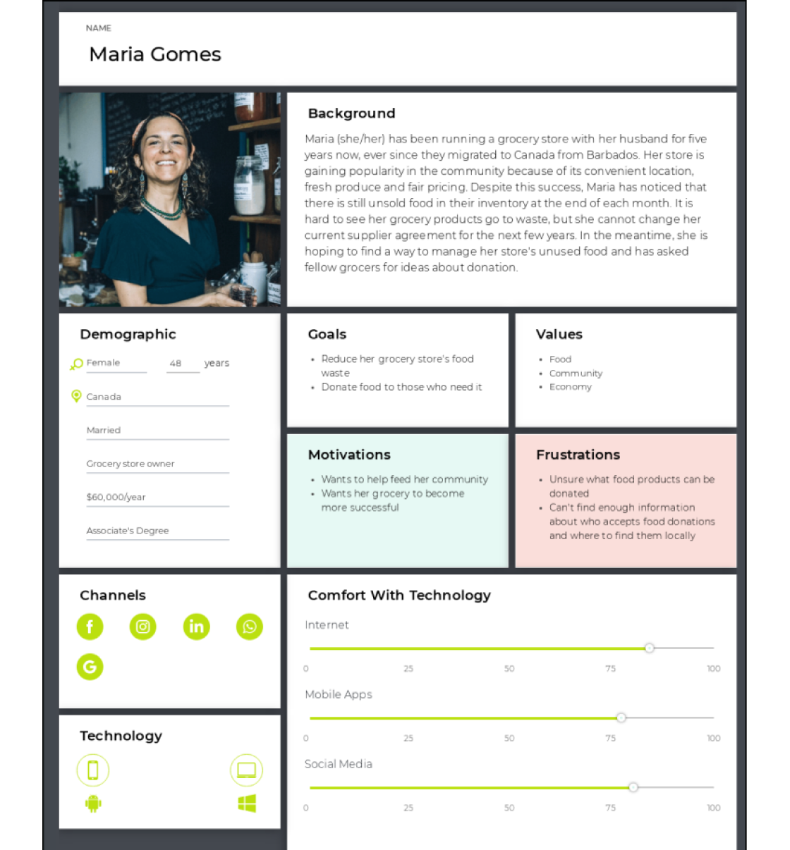
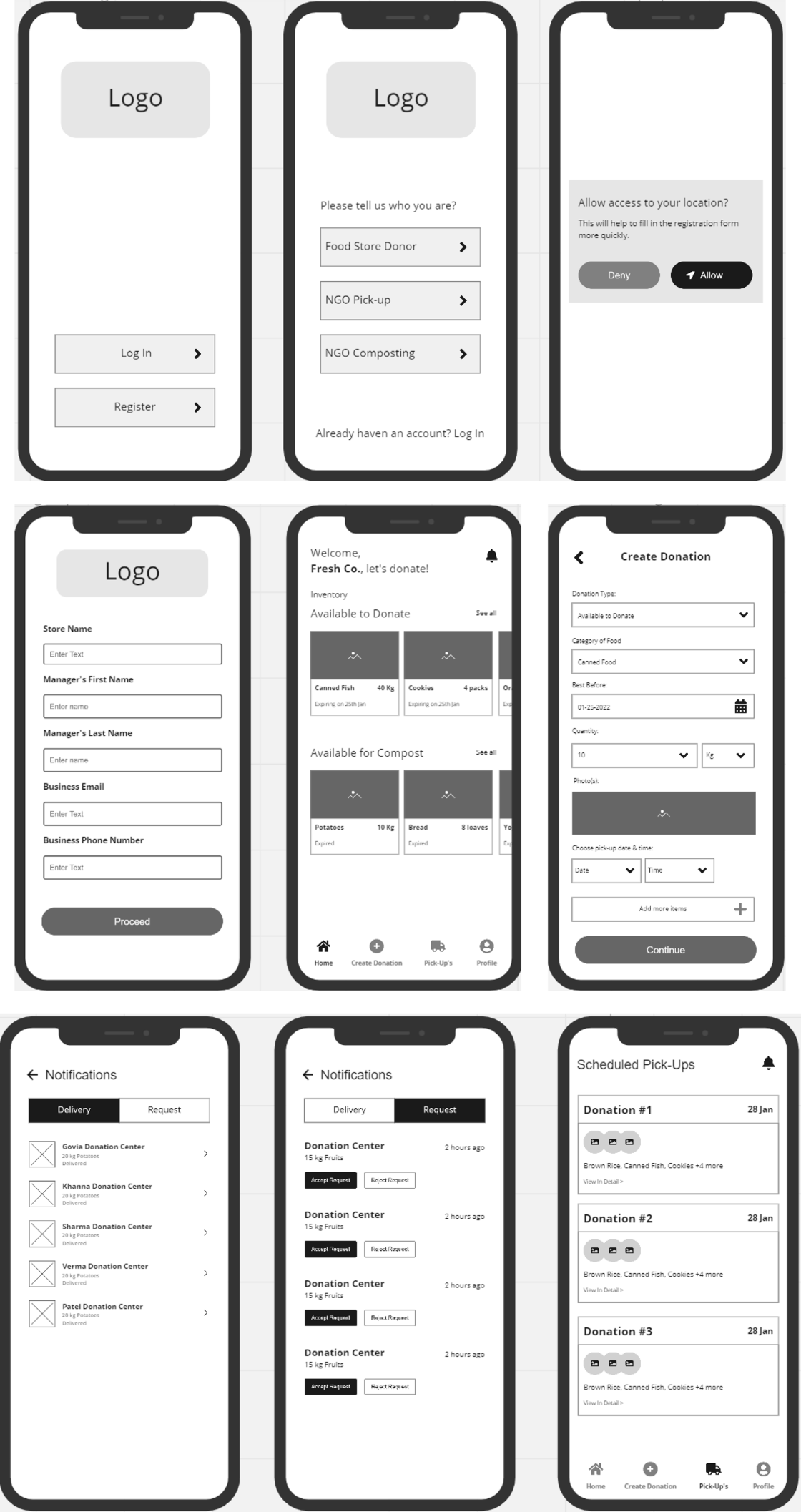
Also key researcher and participated in the research and tried to compile a list of our straight competitors. Personas, crazy 6s, and information architecture were created, as well as some wireframes.
Our research started with Market and Competitive Analysis. Also, People were interviewed to learn about their habits, and daily routines in order to discover some pain and gain that can be resolved by designing a platform.
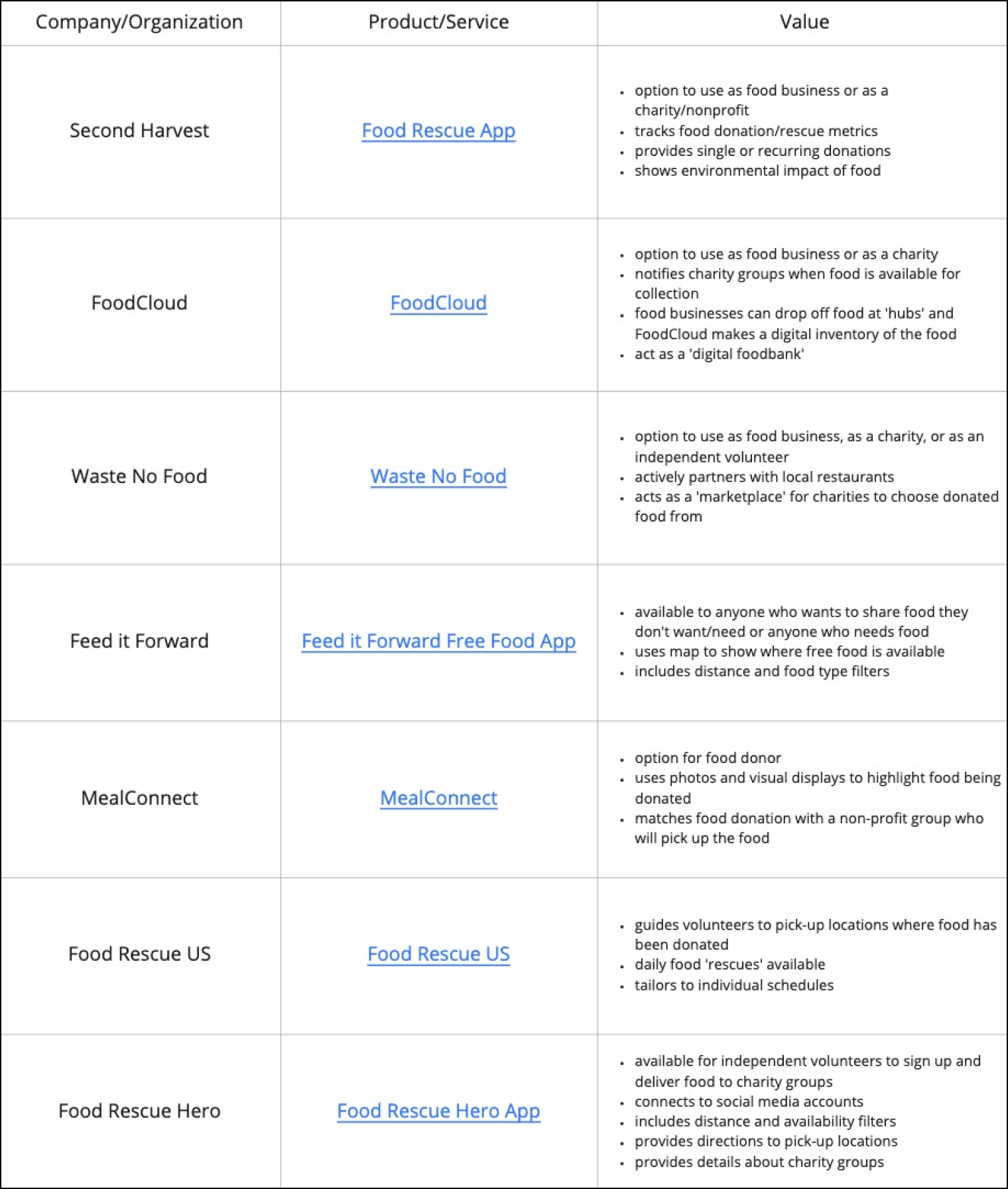
Customer needs served:
- Connecting food businesses with food rescuers
Target customers:
- Food business and charities/non-profit organizations
Things they do well:
- Tracks food donation/rescue metrics
- Provides single or recurring donations
- Gives feedback on environmental impact of food donation
Things they don’t do well:
- Limited live updates or feedback on donations
- Limited use of visuals
Customer needs served:
- App allows donors to connect
with users
Target customers:
- Individuals
- Users from age 22 to 45
Things they do well:
- The onboarding is super easy
- UI is intuitive and visually appealing
Things they don’t do well:
- Not enough information around how it functions
- It doesn’t look easy for older users who may not be familiar with many common mobile app functions
We believe that designing an app that provides multiple donation channels in one platform, integrates with store inventory systems, and notifies users about donation opportunities will help a grocery store owner connect with a food donation partner. We will know this is true when a grocery story owner visits the app every week to make a donation, showing consistency in donations.
We kept this principle at the heart of this product as we wanted our users to able to achieve their goals easily without going through any frustration.
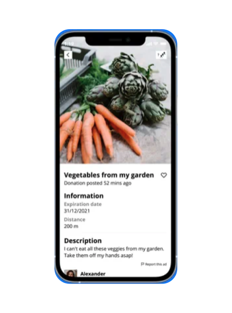
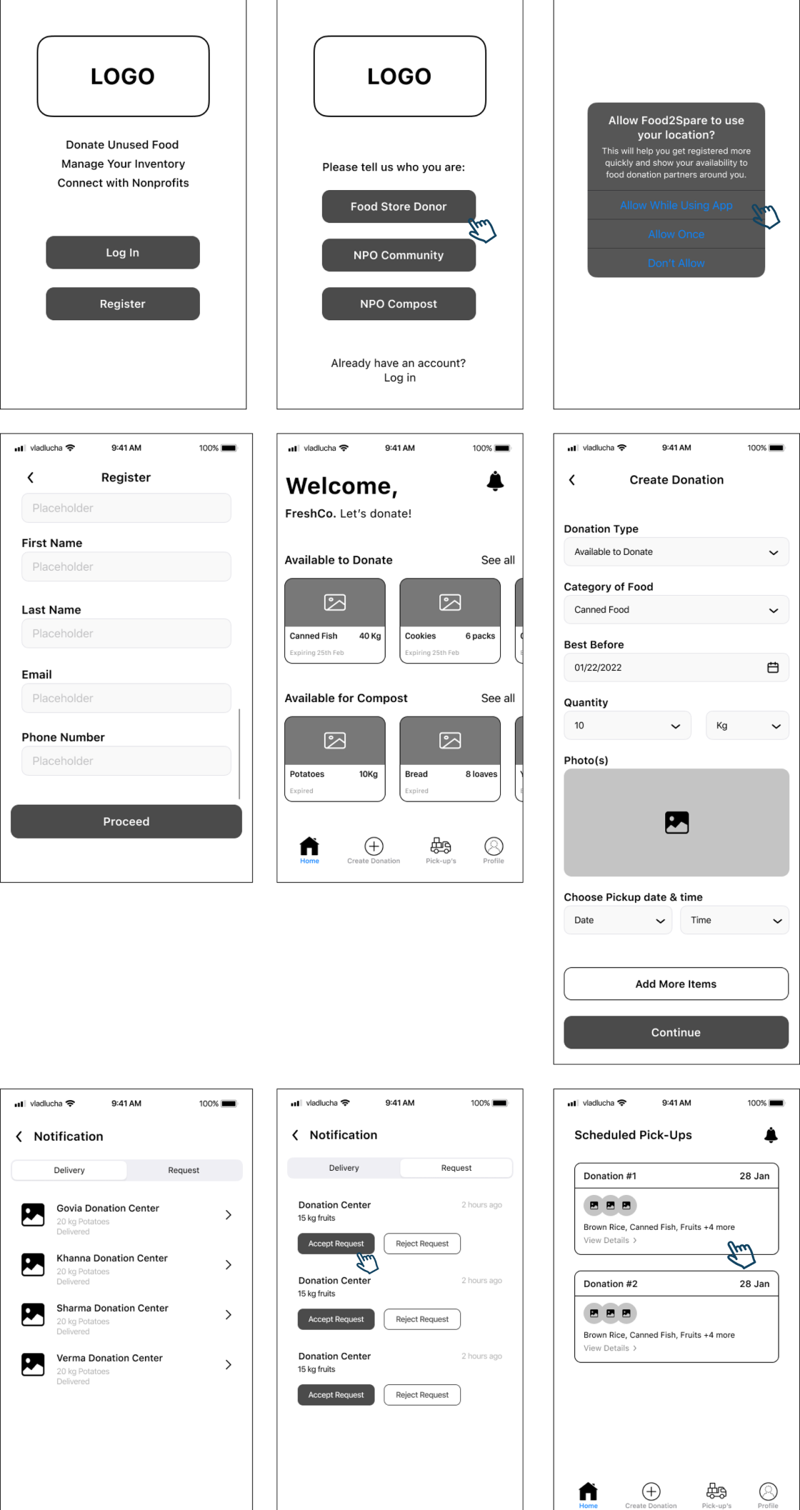
2. Feedback mattersWe adapted this principle and showed feedback to users that their donation is completed with a thank you screen.
3. The user is in controlWe have given our user the control by allowing him to edit and choose while creating a donation. The user can edit the quantity at any time.
4. Use simple languageUsers are multi-tasking, so use words in your design that are closest to the user’s thoughts. So, we followed this principle on all the CTA’s and Title’s.
- Support initiatives to reduce food waste
- Connect food businesses with charities and non-profit organizations who manage food waste (e.g. groups who distribute food to the community or compost food for environmental benefit)
- Highlight various pathways for food waste donation through a digital solution
- Transportation is not provided for users donating food to particular places
- Quality of food is monitored, but not guaranteed and follows Ontario’s Donation of Food Act
- The app does not support AR or other advanced visualization features yet
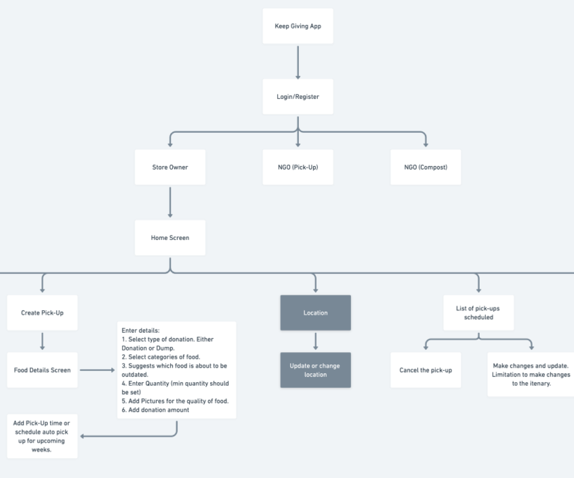
We learnt that ‘less is more’. Based on external feedback and discussions within the team, we were able to narrow the scope of our design solution so that it would focus on one category of users in the intial design. Initially we sketched out our Information Architecture and went through a few iterations of it to improve the placement or direction of the app features. After discussing within the team, we found what pages could become sub-pages and how the app could be minimal while still functioning at its best to achieve the set goals and objectives.
It helped to follow the iOS guidelines in order to understand where margins might go, how typography is styled and much more. The guidelines also helped us align as a team.
Testing your design to: “learn about user behavior and preferences”, “uncover problems” and “discover opportunities to improve” (Nielson Norman Group, 2021).
>>Participants & Methodology- Participants were grocery store employees
- Presented a scenario for participants to understand context of app
- 8 tasks
- Exit questionnaire
- Emphasized think aloud protocol during usability test
- Additional insights from qualitative exit questionnaire
- Successfully completed 6/8 tasks
Gains:
- Inventory management integration
- Notification feature
Pains:
- Missing screen for allowing access to inventory management system (IMS).
- Missing option to cancel donation
1. Add inventory management system (IMS) confirmation during registration
2. Add button to cancel donation
3. Add instruction screens before onboarding to give a preview of what to expect in the app